Overview
If you’ve been trading for any time, you will almost certainly have come across the concept of support and resistance. This powerful and simple concept lies at the heart of technical analysis. It forms the cornerstone of price action trading.
However, you can also think of support and resistance in another way. After all, these are also price areas where a market has paused, reversed, or moved into a congestion phase before moving on. As a result, these price regions are associated with sustained buying and selling, or what Wyckoff called Accumulation and Distribution. These two concepts go hand in hand, and you can think of them in simple terms as follows:
- Accumulation relates to how an area of support performs
- Distribution relates to how an area of resistance performs
It is these two powerful concepts which come together in the Quantum Accumulation and Distribution indicator. It is the act of accumulation (buying) over a sustained period which creates the support region, whilst the act of distribution (selling) over a sustained period creates the resistance region. Having the power to see both, gives you unparalleled insights into price behaviour at these key levels, and the confidence to forecast future market behaviour as a result.
The Old Approach!
Most traders still draw their lines manually, leading to a crude interpretation of these key levels. Even those companies that have developed a trading indicator have developed an equally imprecise tool. No doubt you’ve seen them. Generally, these appear as wide bands on the chart, indicating vague areas of congestion, with associated support and resistance bands. These are virtually useless. They lack precision or definition.
So, why has no one ever considered accumulation and distribution and the associated support and resistance as dynamic? After all, wouldn’t a dynamic indicator deliver high quality information where you need it most – at the live edge of the market?
Well perhaps no one has ever thought about it in this way before. After all, price action is dynamic.
The Accumulation & Distribution Indicator For TradingView
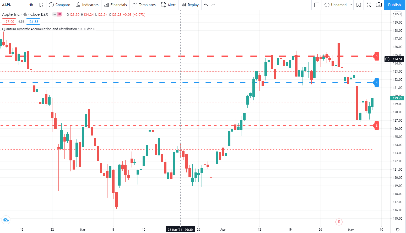
Well, that’s what we thought too, and here it is at last – the Quantum Dynamic Accumulation and Distribution indicator. The first, and only dynamic indicator in the world which displays two things simultaneously. The regions of accumulation and distribution, and from that, the associated price levels of support and resistance. Even more so, it also displays the strength of these regions, the number of times they have been tested, and from which direction. This translates into a visual picture of the accumulation and distribution zones.
Finally, on your TradingView platform, you will have an indicator that truly defines, with pinpoint accuracy, those areas of price support and resistance associated with accumulation and distribution which are so important to you as a trader.
It’s an immensely powerful indicator which maps out the direction of price at any given moment. For most traders, the profit that springs from trading, comes from determining these levels precisely. This indicator will give you the confidence to forecast where the market is likely to move next, giving you the ability to gauge:
- Optimum entry levels
- Safe exit levels
- Proper stop loss levels
- Excellent take profit levels
But There’s More….
But as with all Quantum Trading indicators, there’s more, a great deal more!
What It Will Do For You
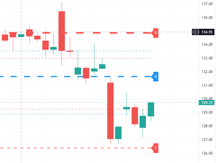
The indicator shows you both graphically and numerically, how many times the price region has been tested. Levels which have been tested several times, will appear as deeper lines, whilst those levels tested only once or twice will appear as narrower lines. This instantly reveals the depth of any accumulation or distribution regions, and hence the likelihood of the level holding or being breached. Each level is painted blue or red to show you whether that level has seen accumulation or distribution in the past. If the level is painted red, then this has been an area of price distribution, and if painted blue then this is accumulation. An area of price accumulation is likely to act as support if approached from above, and if breached from below, to then provide bullish support to a further move higher. Conversely, an area of price distribution is likely to act as resistance if approached from below, and if breached from above, to then provide bearish resistance to a further move lower. The indicator is dynamic, which means the support and resistance lines generated coincide with the current price action.
All Markets
Every market behaves slightly differently. They each have their own price characteristics which are then reflected in the price action, which in turn is reflected in the dynamic accumulation and distribution levels. So, once again, we have included your own fine control. Using the custom option, you can increase or decrease the number of zones that appear on each chart, to suit your own trading style and approach. Some traders prefer more detail, others prefer less. The indicator caters for everyone. It’s a personal choice. It simply means you have full control to customise the indicator the way you want it. Matching the tool to the job means greater consistency and greater profitability.
The Quantum Dynamic Accumulation and Distribution indicator works in all timeframes and other chart types.
Settings
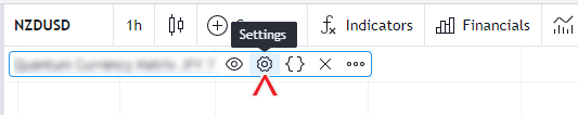
The Settings button appears as a small cog/gear icon beside the name of the indicator at the chart. Clicking the button shows a dialog box for configuring the Inputs and Style options.
Inputs
Look Back
This input determines the number of bars the indicator should include in calculating the support and resistance levels starting from the most current bar down to the nth bar in the history (equal to the value of this input). Increasing its value covers more data in the bar history and will increase the number of support and resistance lines. Conversely, decreasing its value will likely decrease the support and resistance lines as less bars are covered.
Cluster
This input is a factor used in calculating the size of groups or clusters of zones generated by the indicator.
Support Line Color
This input determines the color of the support lines which displays accumulation zones. The default color is blue.
Support Label Color
This input determines the color of the label that accompanies support lines. The default color is blue.
Resistance Line Color
This input determines the color of the resistance lines which displays distribution zones. The default color is red.
Resistance Label Color
This input determines the color of the label that accompanies resistance lines. The default color Is red.
Line Style
You can change the line style of the support and resistance lines using this input. There are 3 options: sol (solid), dot (dotted), and dsh (dashed). The default line style is solid.
Label Offset
This input allows you to move the number labels to the left 1 bar at a time. The default offset is 0.
Display Labels
This input allows you to hide or display the number label of the lines. This option is enabled by default.
Style
Labels
This option sets the visibility of the Label objects created by the indicator. We strongly advise that you keep this option enabled to ensure that the Label elements of the indicator are displayed. You can also hide the labels using the Display Labels input.
Lines
This option sets the visibility of the Line objects created by the indicator. We strongly advise that you keep this option enabled to ensure that the support and resistance lines are displayed.
Alerts
The Dynamic Accumulation and Distribution indicator has 1 alert condition.
Price level tested
Alert Conditions
- Price level tested
Condition
Triggers when the most current candle touches (between the low price and high price of the candle) one of the lines created by the indicator (between the low price and high price of the candle)
Alert message
Examples:
- Price level tested at {current close price}